Klient
Year
Scope of work
- Logo
- UX/UI Design
- Web Design
- E-Commerce
About project
Vancore is a manufacturer of professional gaming desks. The newly established activity, rooted in a long-term family furniture business, gained a new image, a communication key and was enriched with a modern online store.
Core elements
Simplicity, design and elegance. These are the basic features of the VANCORE brand. Therefore, the number of colors has been minimized to the necessary minimum. Shades of cyan and gray dominate here. In writing typefaces, sans serif fonts were used to support the gaming character of the company’s products.
Color
#009fe3
#9d9d9c
#dadada
Typeface
ABCDEFGHIJKLMOPQRSTUVWXZ
abcdefghijklmnopqrstuvwxyz
1234567890
Lorem ipsum dolor sit amet, consectetur adipiscing elit, sed do eiusmod tempor.
Extended Typeface
ABCDEFGHIJKLMOPQRSTUVWXZ
abcdefghijklmnopqrstuvwxyz
1234567890
Lorem ipsum dolor sit amet, consectetur adipiscing elit, sed do eiusmod tempor.
Logo
The logotype, as well as the entire communication key, focuses on a minimalist design that results from the nature of VANCORE products. The logotype itself refers to the arrows on the keyboard and the mouse cursor in the simplest possible form, easy to reproduce on aluminum and wooden elements.


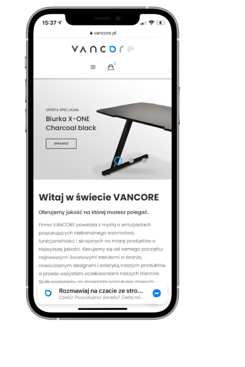
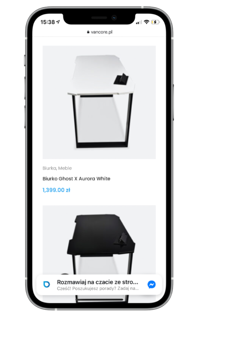
Online store
The main goal of the project was to create a modern online store for the VANCORE company. The store was created on the basis of WooCommerce, in the WordPress environment and is now the main element of the company’s interaction with customers.

#01
#02

#03
Boost your identy!
Boost your business!
Copying the content without the consent of the author is prohibited.